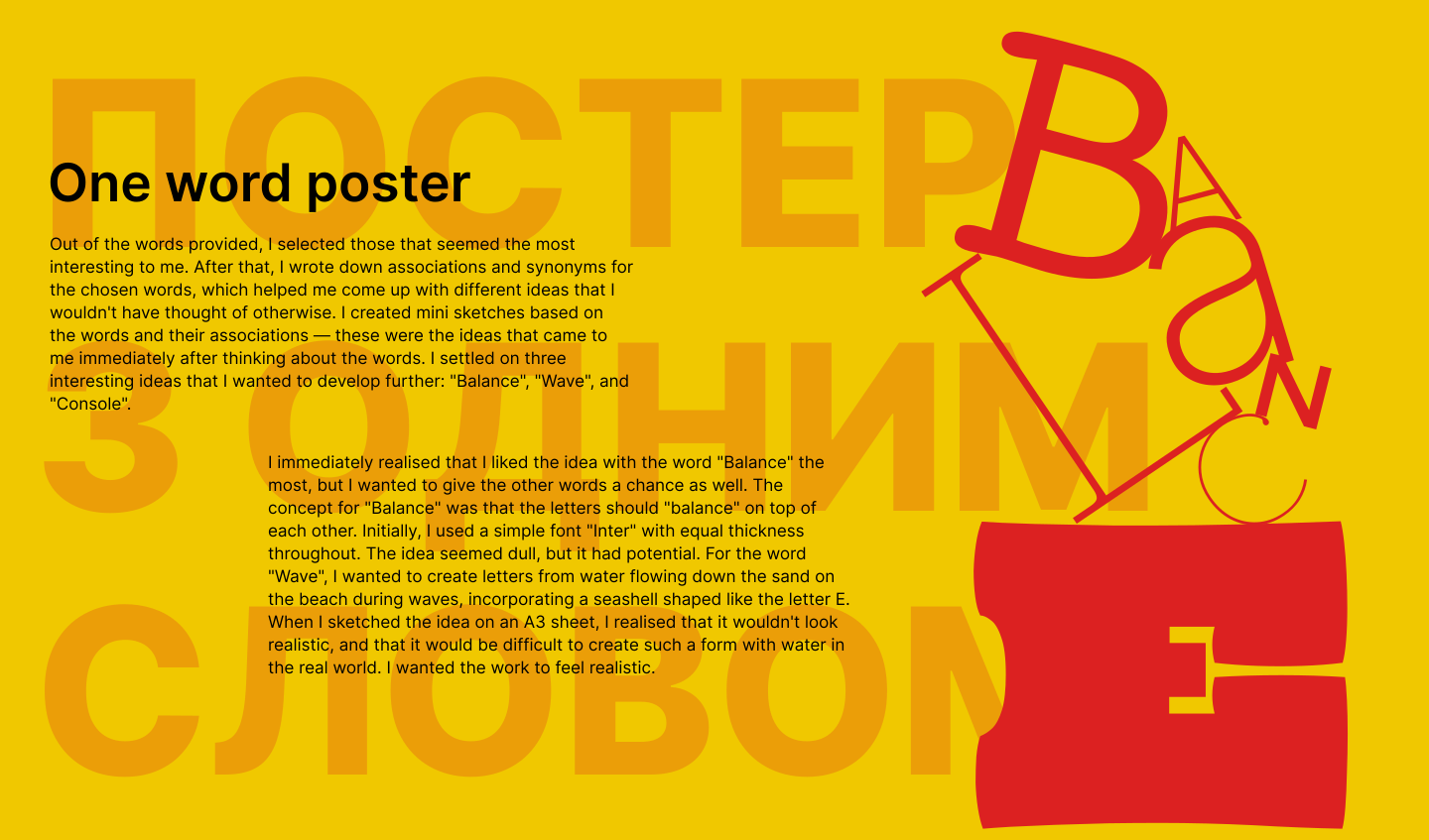


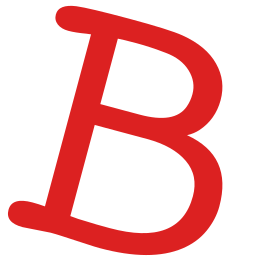
I immediately realised that I liked the idea with the word "Balance" the most, but I wanted to give the other words a chance as well. The concept for "Balance" was that the letters should "balance" on top of each other. Initially, I used a simple font "Inter" with equal thickness throughout. The idea seemed dull, but it had potential. For the word "Wave", I wanted to create letters from water flowing down the sand on the beach during waves, incorporating a seashell shaped like the letter E. When I sketched the idea on an A3 sheet, I realised that it wouldn't look realistic, and that it would be difficult to create such a form with water in the real world. I wanted the work to feel realistic.
One word poster
Out of the words provided, I selected those that seemed the most interesting to me. After that, I wrote down associations and synonyms for the chosen words, which helped me come up with different ideas that I wouldn't have thought of otherwise. I created mini sketches based on the words and their associations — these were the ideas that came to me immediately after thinking about the words. I settled on three interesting ideas that I wanted to develop further: "Balance", "Wave", and "Console".
Мені сказали зробити багато, я і зробила
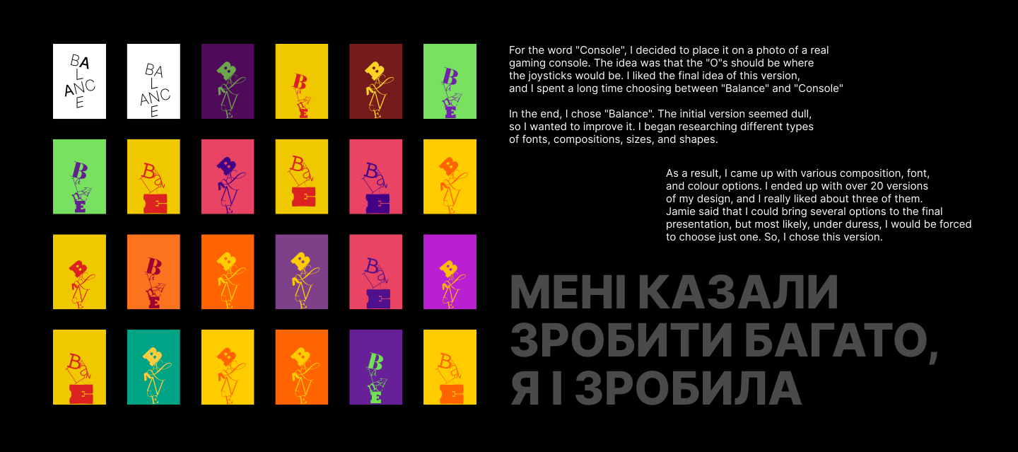
For the word "Console", I decided to place it on a photo of a real gaming console. The idea was that the "O"s should be where
the joysticks would be. I liked the final idea of this version,
and I spent a long time choosing between "Balance" and "Console"
In the end, I chose "Balance". The initial version seemed dull,
so I wanted to improve it. I began researching different types
of fonts, compositions, sizes, and shapes.
the joysticks would be. I liked the final idea of this version,
and I spent a long time choosing between "Balance" and "Console"
In the end, I chose "Balance". The initial version seemed dull,
so I wanted to improve it. I began researching different types
of fonts, compositions, sizes, and shapes.
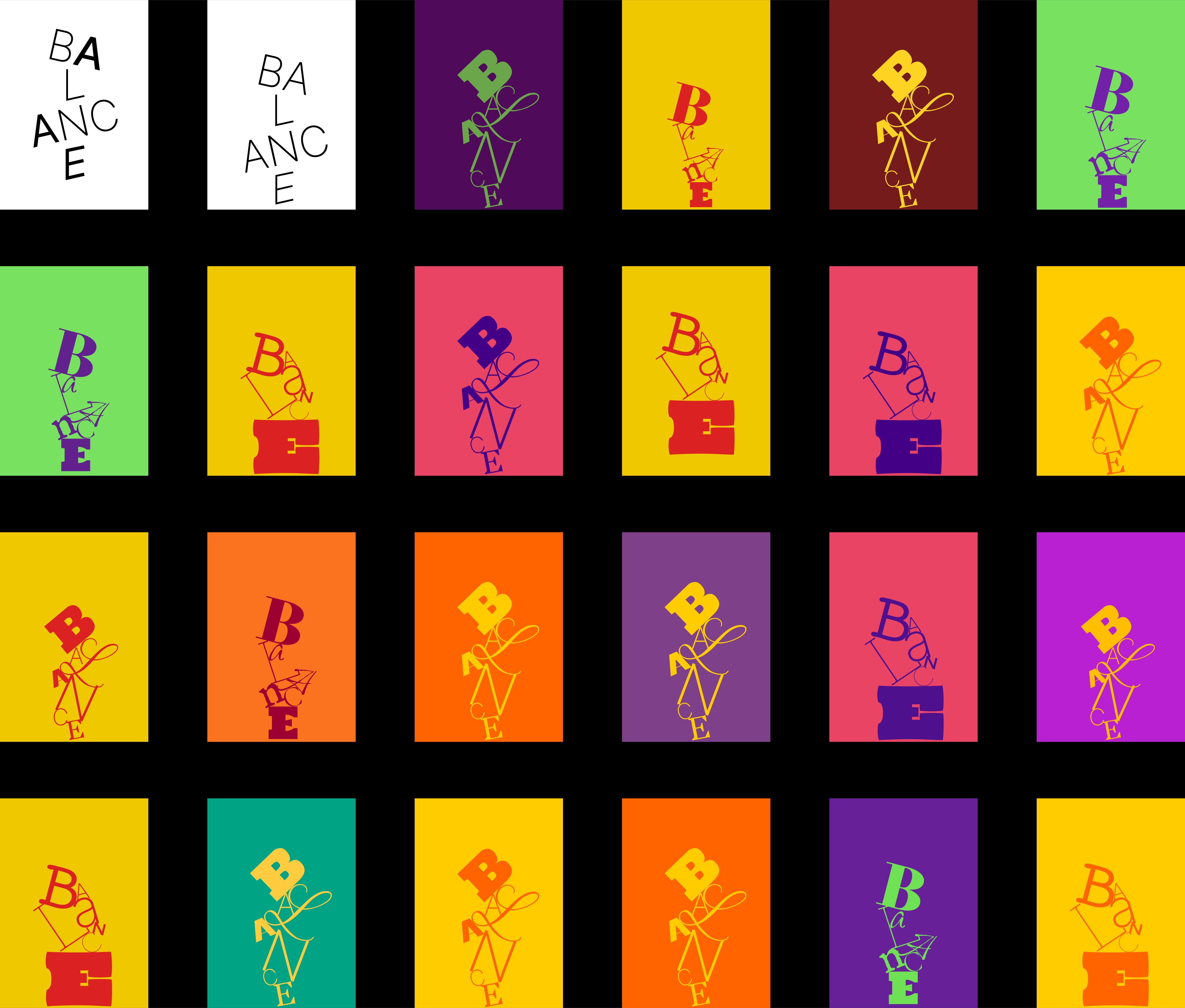
As a result, I came up with various composition, font,
and colour options. I ended up with over 20 versions
of my design, and I really liked about three of them.
Jamie said that I could bring several options to the final presentation, but most likely, under duress, I would be forced
to choose just one. So, I chose this version.
and colour options. I ended up with over 20 versions
of my design, and I really liked about three of them.
Jamie said that I could bring several options to the final presentation, but most likely, under duress, I would be forced
to choose just one. So, I chose this version.
Увага
сир
cheese
attention
Personal Type
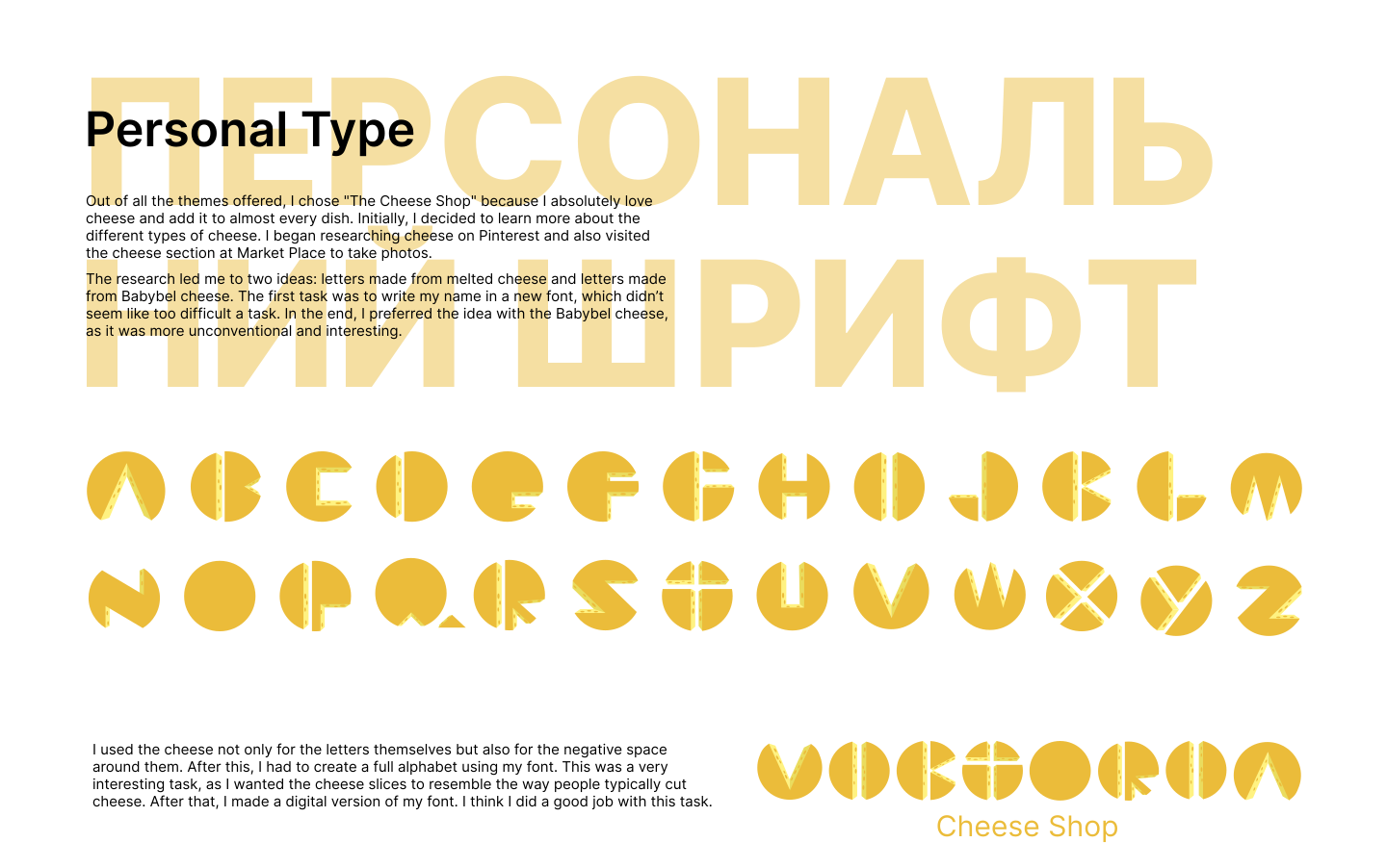
I used the cheese not only for the letters themselves but also for the negative space
around them. After this, I had to create a full alphabet using my font. This was a very interesting task, as I wanted the cheese slices to resemble the way people typically cut cheese. After that, I made a digital version of my font. I think I did a good job with this task.
around them. After this, I had to create a full alphabet using my font. This was a very interesting task, as I wanted the cheese slices to resemble the way people typically cut cheese. After that, I made a digital version of my font. I think I did a good job with this task.
The research led me to two ideas: letters made from melted cheese and letters made from Babybel cheese. The first task was to write my name in a new font, which didn’t seem like too difficult a task. In the end, I preferred the idea with the Babybel cheese,
as it was more unconventional and interesting.
as it was more unconventional and interesting.
Out of all the themes offered, I chose "The Cheese Shop" because I absolutely love cheese and add it to almost every dish. Initially, I decided to learn more about the different types of cheese. I began researching cheese on Pinterest and also visited
the cheese section at Market Place to take photos.
the cheese section at Market Place to take photos.


Spoiler: no
Everyone loves cats
Sense of Place
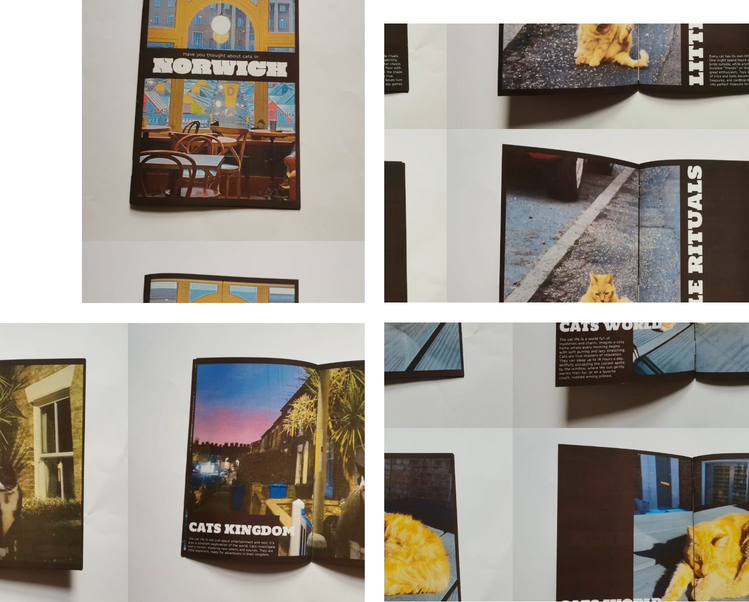
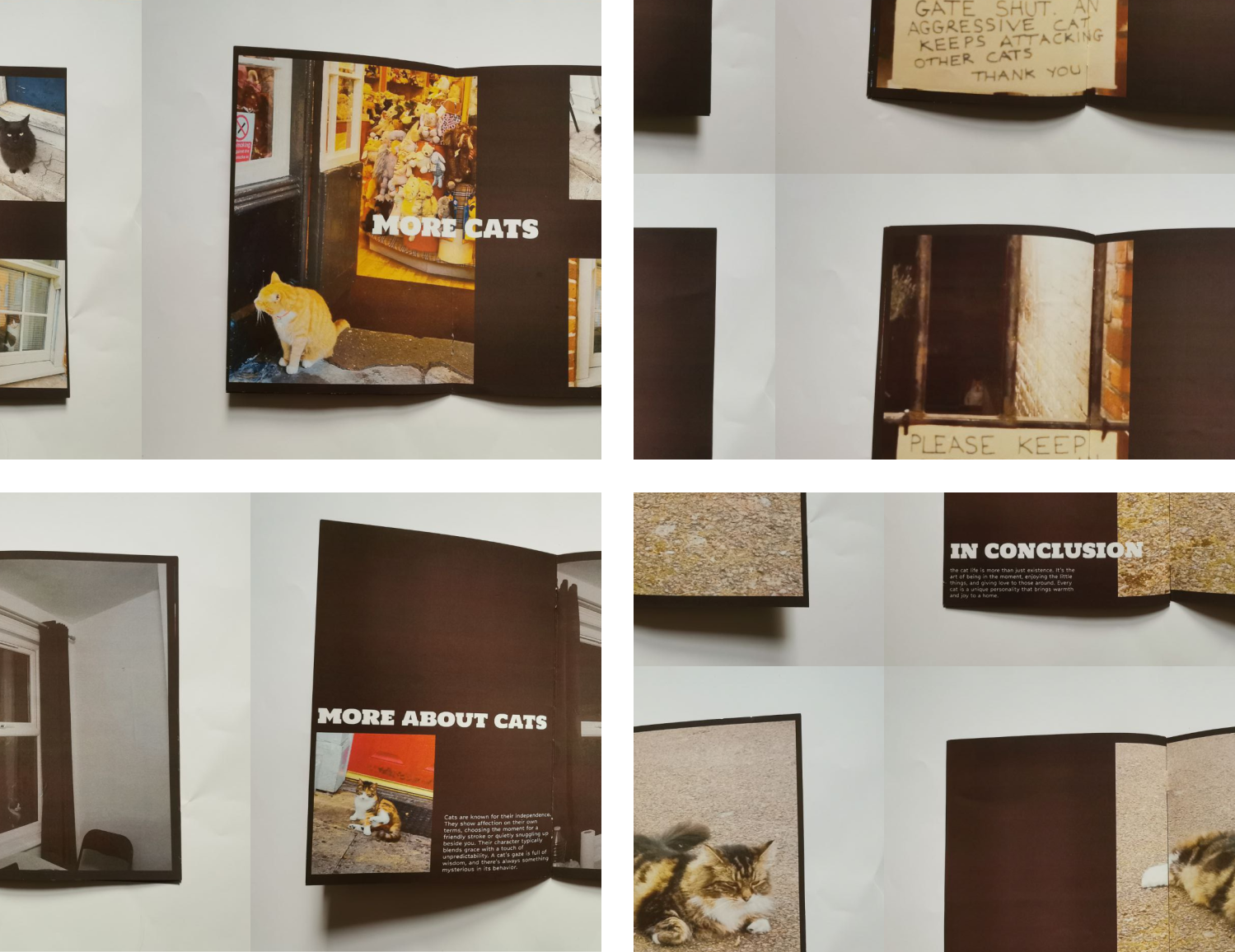
Another challenge was working with the printer. Since I had never used a printer before starting university, it was quite difficult for me to figure it out. Luckily, the support team was nearby, especially Michael, who answered all my "silly" questions. He has probably already memorised me, and every time he sees me, he probably thinks, "Oh no, here she comes again, asking where to put the paper and why the text looks pixelated when she exports her work as a .png." He also taught me how to use a stapler for magazines and a trimming knife for cutting the edges, so I wouldn’t cut my fingers off. After two weeks, I had a small magazine about cats in my hands. I’ll probably redo it again because I already have ideas on how I could improve it.
I printed out all the pages to see how my design would look on paper. Naturally, I didn’t like it, but it helped me identify and fix many of my mistakes for the future. The first thing that stood out was that the text was too large. Also, because of the colour saturation in the photos, I didn’t like how the printer had printed them. So, I decided to print several test sheets where I arranged fonts of different sizes to see which one I liked the most. After this, I decided to completely redo the design and concept of my magazine, as I wasn’t happy with how it turned out. So, I dove back into research and found a lot of cool new ideas.
I printed out all my photos in a small size, cut them out, and started creating different combinations of stories. Once I settled on the best combination of photos, I did quick sketches for the future magazine. Then I began researching. I found interesting ideas for combining text and images, different font pairings, and font sizes. The most difficult part of this project for me was using InDesign. It was a real challenge because I had been using Figma for a long time before this. While the purpose of both programs is similar, their functionality is very different, which really confused and frustrated me. However, I managed to get through it. (I hope that in the future I’ll work in a company that uses Figma). I also did some colour correction on the photos, as I had taken them with my phone and didn’t like how they looked in their original form.
This project was the most extensive of all, which made it particularly interesting. Additionally, I had never worked with publication design before, so I felt a bit challenged by the task. I immediately knew I wanted to do a project about the streets of Norwich, but I wanted to choose a theme that no one else would be doing. I began by photographing interesting compositions on the streets of Norwich — things that were unusual or out of the ordinary. For example, strange objects that clearly didn’t belong where they were, such as Tesco trolleys in a residential area. After reviewing all my photos a couple of days later, I noticed a pattern. A "cat" pattern. I had so many photos of cats. I thought this was exactly what I needed.
I hate this project as much as I love cats.